Pyecharts绘图教程(2)—— 解决Pyechart绘图add_yaxis颜色参数设置问题(原理+方法)
- 教程系列
- 2025-07-23
- 1826热度
- 0评论
大家好,我是欧K~
《Pyecharts绘图教程》的 第 2 期 中有一个遗留问题,Pyechart绘图add_yaxis颜色参数设置颠倒问题,今天我们来详细介绍一下这个问题存在的原理的解决方法。
1. 问题描述
在使用 pyecharts 库绘制折线图时,设置 add_yaxis 颜色参数无效(这里是两个系列相反),代码图示如下:
x_data = ["周一", "周二", "周三", "周四", "周五", "周六", "周日"]
y_data1 = [120, 132, 101, 134, 90, 200, 180]
y_data2 = [i/2 for i in y_data1]
line = (
    Line()
    .add_xaxis(x_data)
    .add_yaxis("销量", y_data1, color='blue')
    .add_yaxis("利润", y_data2, color='green')
    .set_global_opts(title_opts=opts.TitleOpts(title="示例5"))
)
line.render_notebook()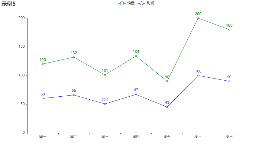
代码里销量折线 color=‘blue’,利润折线 color=‘green’,但是图上两个颜色是相反的???
实际上在柱状图上也是一样:
x_data = ["周一", "周二", "周三", "周四", "周五", "周六", "周日"]
y_data1 = [120, 132, 101, 134, 90, 200, 180]
y_data2 = [i/2 for i in y_data1]
bar = (
    Bar()
    .add_xaxis(x_data)
    .add_yaxis("销量", y_data1, color='blue')
    .add_yaxis("利润", y_data2, color='green')
    .set_global_opts(title_opts=opts.TitleOpts(title="示例1"))
)
bar.render_notebook()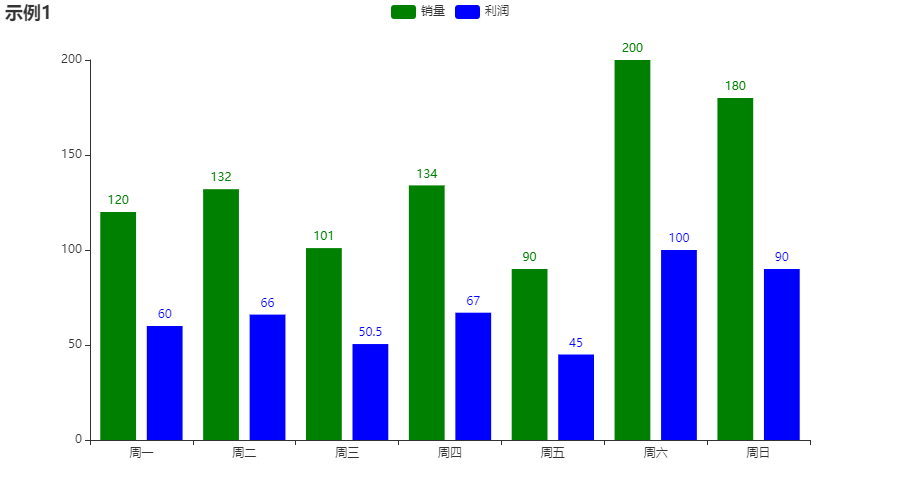
接下来,看看哪里出了问题。。。
2. 查找原因
2.1 查看源码
遇到问题,查看源码是最直接的排查方式!
2.2 Line类
class Line(RectChart):
    """
    <<< Line Chart >>>

    Line chart is a graph that connects all data points
    with single line to show the change trend of data.
    """

    def add_yaxis(
        self,
        series_name: str,
        y_axis: types.Sequence[types.Union[opts.LineItem, dict]],
        *,
        is_selected: bool = True,
        is_connect_nones: bool = False,
        xaxis_index: types.Optional[types.Numeric] = None,
        yaxis_index: types.Optional[types.Numeric] = None,
        color: types.Optional[str] = None,
        is_symbol_show: bool = True,
        symbol: types.Optional[str] = None,
        symbol_size: types.Union[types.Numeric, types.Sequence] = 4,
        stack: types.Optional[str] = None,
        is_smooth: bool = False,
        is_clip: bool = True,
        is_step: bool = False,
        is_hover_animation: bool = True,
        z_level: types.Numeric = 0,
        z: types.Numeric = 0,
        markpoint_opts: types.MarkPoint = None,
        markline_opts: types.MarkLine = None,
        tooltip_opts: types.Tooltip = None,
        itemstyle_opts: types.ItemStyle = None,
        label_opts: types.Label = opts.LabelOpts(),
        linestyle_opts: types.LineStyle = opts.LineStyleOpts(),
        areastyle_opts: types.AreaStyle = opts.AreaStyleOpts(),
    ):
        self._append_color(color)
        self._append_legend(series_name, is_selected)

        if all([isinstance(d, opts.LineItem) for d in y_axis]):
            data = y_axis
        else:
            # 合并 x 和 y 轴数据,避免当 X 轴的类型设置为 'value' 的时候,
            # X、Y 轴均显示 Y 轴数据
            data = [list(z) for z in zip(self._xaxis_data, y_axis)]

        self.options.get("series").append(
            {
                "type": ChartType.LINE,
                "name": series_name,
                "connectNulls": is_connect_nones,
                "xAxisIndex": xaxis_index,
                "yAxisIndex": yaxis_index,
                "symbol": symbol,
                "symbolSize": symbol_size,
                "showSymbol": is_symbol_show,
                "smooth": is_smooth,
                "clip": is_clip,
                "step": is_step,
                "stack": stack,
                "data": data,
                "hoverAnimation": is_hover_animation,
                "label": label_opts,
                "lineStyle": linestyle_opts,
                "areaStyle": areastyle_opts,
                "markPoint": markpoint_opts,
                "markLine": markline_opts,
                "tooltip": tooltip_opts,
                "itemStyle": itemstyle_opts,
                "zlevel": z_level,
                "z": z,
            }
        )
        return self
可以看到参数 color 在 add_yaxis() 方法里有一个 self._append_color(color) 的操作,那么 _append_color 里面又是什么?
注意这里 class Line(RectChart) -- Line类继承了RectChart类
2.3 RectChart类
class RectChart(Chart):
    def __init__(self, init_opts: types.Init = opts.InitOpts()):
        super().__init__(init_opts=init_opts)
        self.options.update(xAxis=[opts.AxisOpts().opts], yAxis=[opts.AxisOpts().opts])

    def extend_axis(
        self,
        xaxis_data: Sequence = None,
        xaxis: types.Axis = None,
        yaxis: types.Axis = None,
    ):
        if xaxis is not None:
            if isinstance(xaxis, opts.AxisOpts):
                xaxis = xaxis.opts
            xaxis.update(data=xaxis_data)
            self.options["xAxis"].append(xaxis)
        if yaxis is not None:
            if isinstance(yaxis, opts.AxisOpts):
                yaxis = yaxis.opts
            self.options["yAxis"].append(yaxis)
        return self

    def add_xaxis(self, xaxis_data: Sequence):
        self.options["xAxis"][0].update(data=xaxis_data)
        self._xaxis_data = xaxis_data
        return self

    def reversal_axis(self):
        self.options["yAxis"][0]["data"] = self._xaxis_data
        self.options["xAxis"][0]["data"] = None
        return self

    def overlap(self, chart: Base):
        self.options.get("legend")[0].get("data").extend(
            chart.options.get("legend")[0].get("data")
        )
        self.options.get("legend")[0].get("selected").update(
            chart.options.get("legend")[0].get("selected")
        )
        self.options.get("series").extend(chart.options.get("series"))
        return self
发现这里并没有 _append_color() 函数。
继续向上找 class RectChart(Chart) -- RectChart类继承了Chart类
2.4 Chart类
class Chart(Base):
    def __init__(self, init_opts: types.Init = opts.InitOpts()):
        if isinstance(init_opts, dict):
            temp_opts = opts.InitOpts()
            temp_opts.update(**init_opts)
            init_opts = temp_opts
        super().__init__(init_opts=init_opts)
        self.colors = (
            "#c23531 #2f4554 #61a0a8 #d48265 #749f83 #ca8622 #bda29a #6e7074 "
            "#546570 #c4ccd3 #f05b72 #ef5b9c #f47920 #905a3d #fab27b #2a5caa "
            "#444693 #726930 #b2d235 #6d8346 #ac6767 #1d953f #6950a1 #918597"
        ).split()
        if init_opts.opts.get("theme") == ThemeType.WHITE:
            self.options.update(color=self.colors)
        self.options.update(
            series=[],
            legend=[{"data": [], "selected": dict()}],
            tooltip=opts.TooltipOpts().opts,
        )
        self._chart_type: Optional[str] = None
        '''
      省略
      省略
      省略
      '''
        return self

    def _append_legend(self, name, is_selected):
        self.options.get("legend")[0].get("data").append(name)
        self.options.get("legend")[0].get("selected").update({name: is_selected})

    def _append_color(self, color: Optional[str]):
        if color:
            self.colors = [color] + self.colors
            if self.theme == ThemeType.WHITE:
                self.options.update(color=self.colors)
    '''
    后面还有太长就省略了
    后面还有太长就省略了
    后面还有太长就省略了
    '''
}
在这里我们看到 _append_color() 函数功能是把传进来的 color 参数插入到原有 self.colors 列表的前面(首位)!
2.5 定位原因
我们看看生成的html是不是如前面分析的那样:
x_data = ["周一", "周二", "周三", "周四", "周五", "周六", "周日"]
y_data1 = [120, 132, 101, 134, 90, 200, 180]
y_data2 = [i/2 for i in y_data1]
line = (
    Line()
    .add_xaxis(x_data)
    .add_yaxis("销量", y_data1, color='blue')
    .add_yaxis("利润", y_data2, color='green')
    .set_global_opts(title_opts=opts.TitleOpts(title="示例5"))
)
line.render('设置两个颜色.html')
查看 pyecharts 生成的 html 源码:
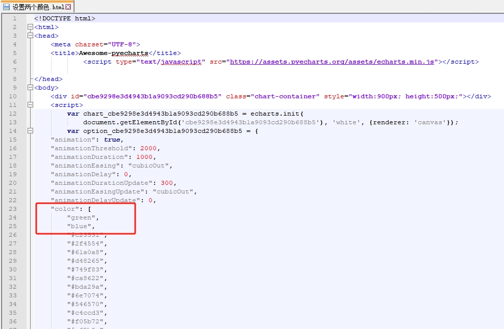
颜色列表先插入的 `blue` ,再插入 `green`,都是在头部插入:
"color": [
        "green",
        "blue",
        "#c23531",
        "#2f4554",
        "#61a0a8",
        "#d48265",
        "#749f83",
        "#ca8622",
        "#bda29a",
        "#6e7074",
        "#546570",
        "#c4ccd3",
        "#f05b72",
        "#ef5b9c",
        "#f47920",
        "#905a3d",
        "#fab27b",
        "#2a5caa",
        "#444693",
        "#726930",
        "#b2d235",
        "#6d8346",
        "#ac6767",
        "#1d953f",
        "#6950a1",
        "#918597"
    ]
2.6 echarts验证问题
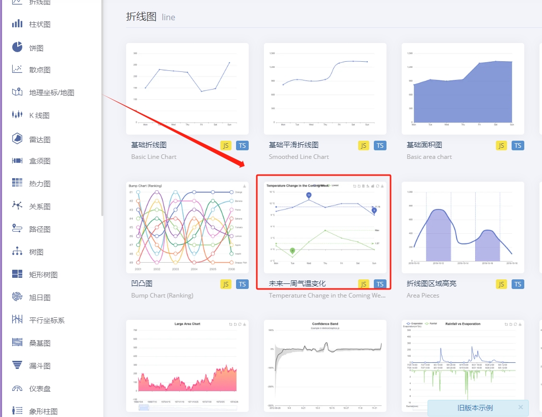
找到颜色列表后我们在 echarts 官网验证一下,打开官网后,选择这幅图(只要多条曲线的图都可以):
我们在源码里加上颜色列表,为了更加明显我把绿色(green)改成了红色(red):
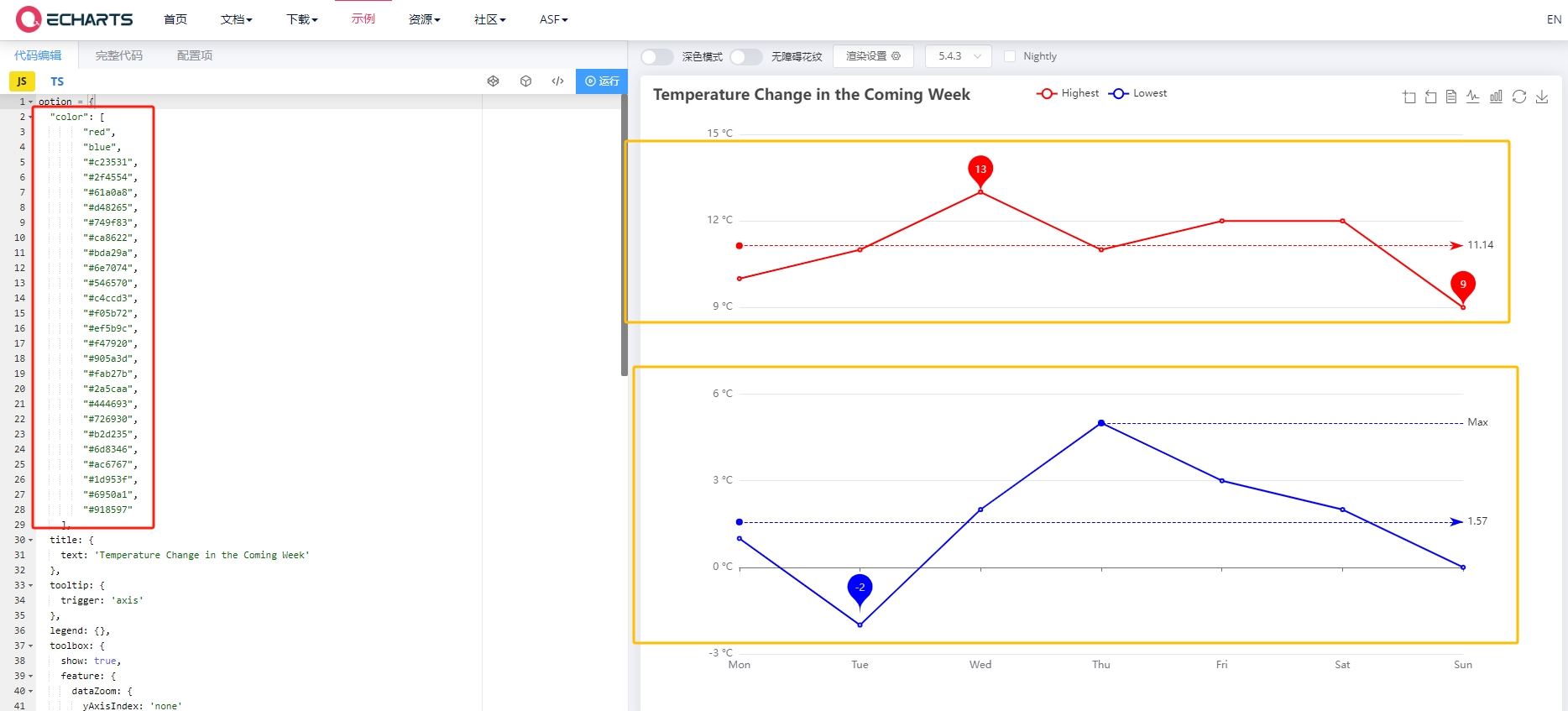
从图上可以看到图中各个系列的颜色是根据 color 颜色列表顺序匹配的,所以我们在 add_yaxis 里面设置多个颜色时,顺序被颠倒了,这就是问题根源所在!
问题分析到这里基本上就结束了。
下面来看怎么解决这个问题。
3. 解决方法
这里不考虑一个系列的问题,因为只有一个系列的话怎么设置都可以。
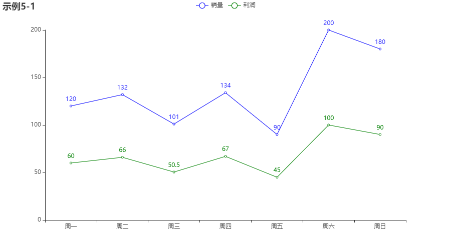
3.1 方法一
line = (
    Line()
    .add_xaxis(x_data)
    .add_yaxis("销量", y_data1, itemstyle_opts=opts.ItemStyleOpts(color="blue"))
    .add_yaxis("利润", y_data2, itemstyle_opts=opts.ItemStyleOpts(color="green"))
    .set_global_opts(title_opts=opts.TitleOpts(title="示例5-1"))
)
3.2 方法二
line = (
    Line()
    .add_xaxis(x_data)
    .add_yaxis("销量", y_data1)
    .add_yaxis("利润", y_data2)
    .set_colors(['blue','green'])
    .set_global_opts(title_opts=opts.TitleOpts(title="示例5-1"))
)
可以自行查看两种方法的html源码,加深理解。
代码实战-scaled.png)