63 Pandas+Pyecharts | 泡泡玛特微博热搜评论数据分析可视化
- 可视化系列
- 2025-07-17
- 1941热度
- 1评论
大家好,我是欧K~
本期我们利用Python分析「微博泡泡玛特热搜评论数据集」,看看:各用户评论IP地图分布、话题点赞热度趋势、话题评论热度趋势、各个时间段评论数量、舆论情感分布、用户性别占比、评论内容词云等等,希望对大家有所帮助,如有疑问或者需要改进的地方可以联系小编。

涉及到的库:
Pandas— 数据处理
Pyecharts— 数据可视化
🏳️🌈 1. 导入模块
import jieba
import pandas as pd
from snownlp import SnowNLP
from pyecharts.charts import *
from pyecharts import options as opts
import warnings
warnings.filterwarnings('ignore')🏳️🌈 2. Pandas数据处理
2.1 读取数据
df = pd.read_excel('微博泡泡玛特数据.xlsx')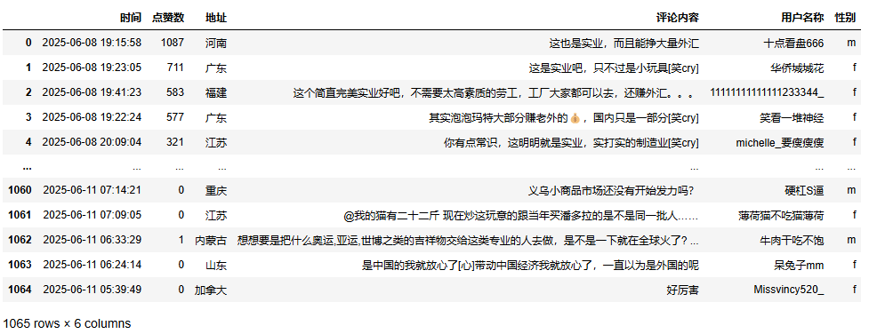
2.2 数据信息
df.info()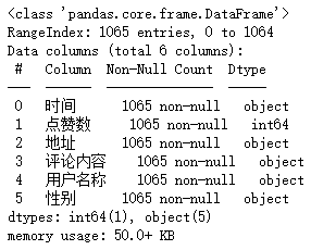
2.3 数据去重
df1 = df.drop_duplicates()2.4 数据去空
df1 = df1.dropna()2.5 时间处理
df1['发布时间_s'] = df1['时间'].str[:10]
df1['时间_d'] = pd.to_datetime(df1['时间']).dt.day
df1['时间_h'] = pd.to_datetime(df1['时间']).dt.hour
2.6 性别处理
df1['性别'] = df1['性别'].replace({'f':'女性','m':'男性'})2.7 评论内容处理
score = []
for comm in comments:
    s = SnowNLP(comm)
    score.append(round(s.sentiments,4))
df1['情感评分'] = score
df1['情感评分区间'] = pd.cut(df1['情感评分'],bins=[0,0.3,0.7,1],labels=['消极','中性','积极'])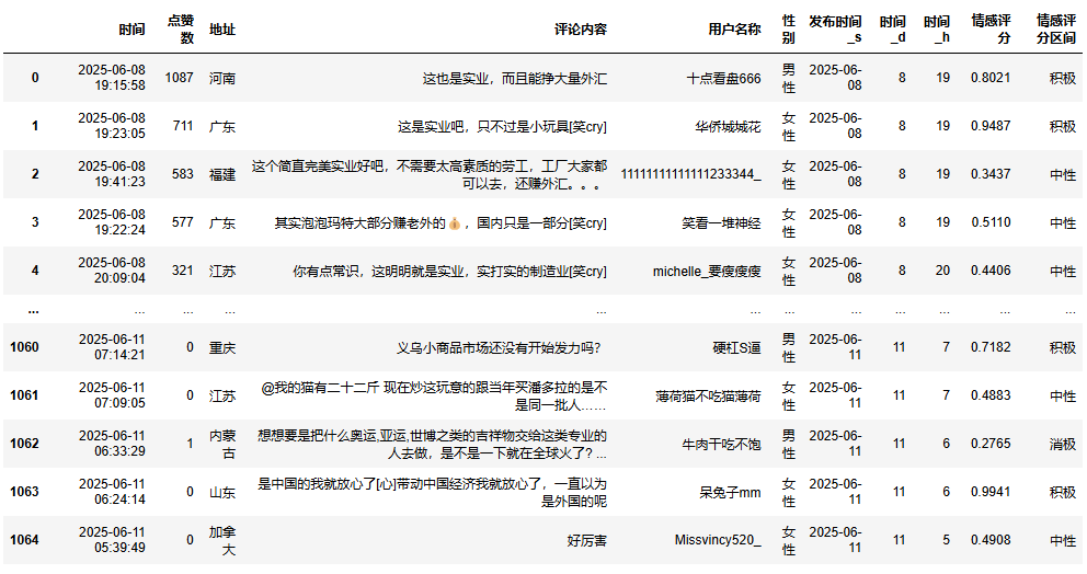
🏳️🌈 3. Pyecharts数据可视化
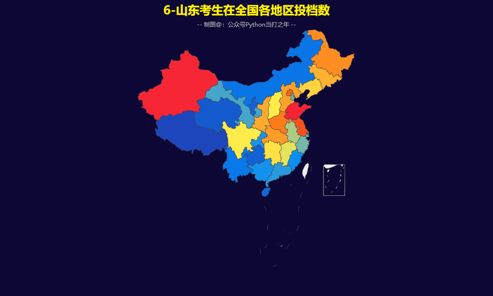
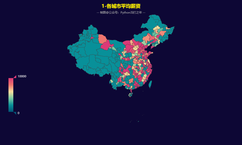
3.1 用户评论IP分布
def get_chart():
    chart = (
        Map()
        .add('', data, 'china')
        .set_global_opts(
            title_opts=opts.TitleOpts(
                title='1-用户评论IP分布',
                subtitle=subtitle,
                pos_top='2%',pos_left='center',
                title_textstyle_opts=opts.TextStyleOpts(font_size=20)
            ),
            visualmap_opts=opts.VisualMapOpts(
                is_show=True,
                pos_left='15%',
                pos_bottom='10%',
                range_color=range_color
            ),
            legend_opts=opts.LegendOpts(is_show=False)
        )
    )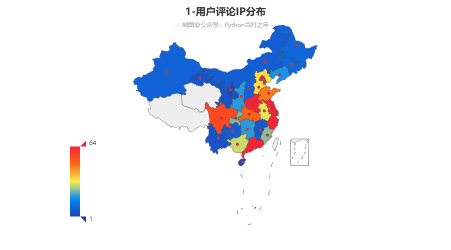
-
东部地区评论数量要明显高于中西部地区,沿海地区更为明显,也从侧面反映了当地的经济情况。
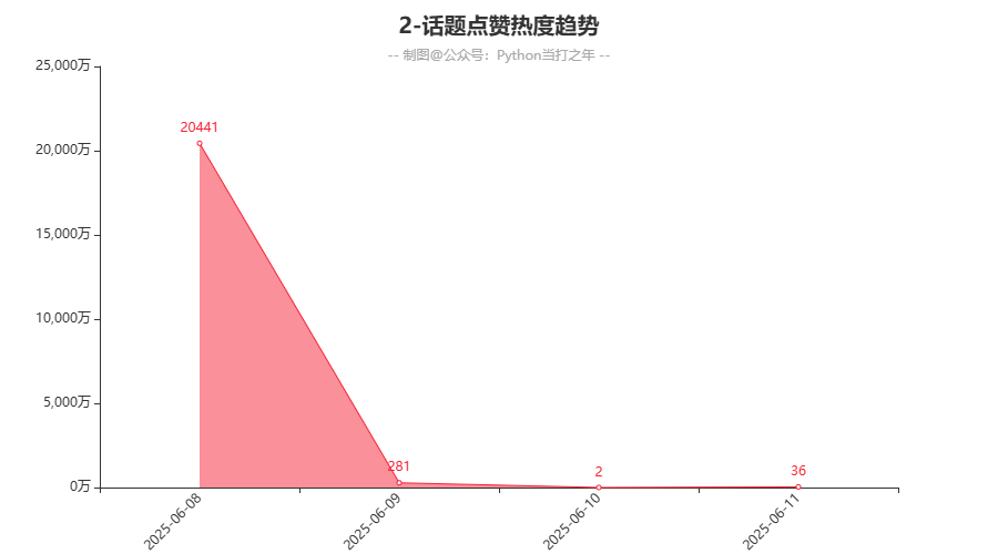
3.2 话题点赞热度趋势
-
话题热度在06-08当天最高,后续持续下降,符合一般的舆情趋势。
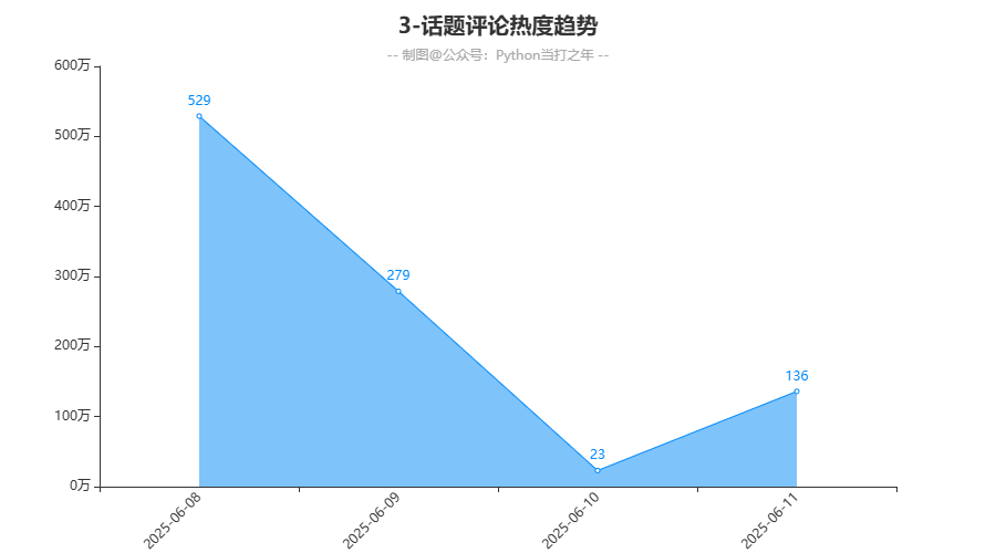
3.3 话题评论热度趋势
def get_chart():
    chart = (
        Line()
        .add_xaxis(x_data)
        .add_yaxis('', y_data)
        .set_colors(range_color[1])
        .set_global_opts(
            title_opts=opts.TitleOpts(
                title='3-话题评论热度趋势',
                subtitle=subtitle,
                pos_top='2%',pos_left='center',
                title_textstyle_opts=opts.TextStyleOpts(font_size=20)
            ),
            legend_opts=opts.LegendOpts(is_show=False)
        )
    )
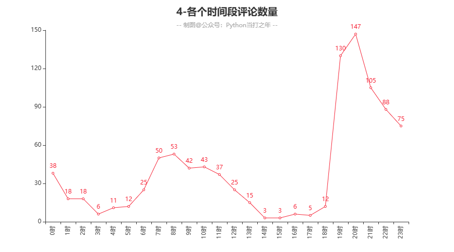
3.4 各个时间段评论数量
-
从评论时间上来看,在晚上的19:00-21:00期间评论量达到顶峰,其他时间较平缓,在早上的07:00-09:00出现次高峰,这个时间也是上班高峰时间。
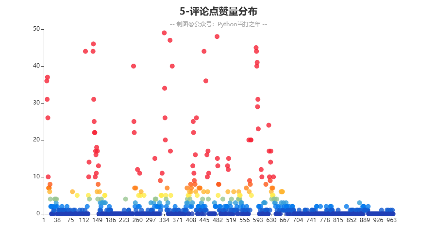
3.5 评论点赞量分布
def get_chart():
    chart = (
        Scatter()
        .add_xaxis(x_data)
        .add_yaxis('', y_data,label_opts=opts.LabelOpts(is_show=False))
        .set_global_opts(
            title_opts=opts.TitleOpts(
                title='5-评论点赞量分布',
                subtitle=subtitle,
                pos_top='2%',pos_left='center',
                title_textstyle_opts=opts.TextStyleOpts(font_size=20)
            ),
            visualmap_opts=opts.VisualMapOpts(
                is_show=False,
                range_color=range_color
            ),
            legend_opts=opts.LegendOpts(is_show=False)
        )
    )
3.6 舆论情感分布
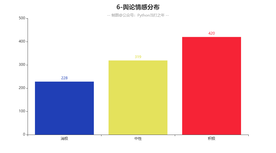
-
舆情方面在,大众的积极情绪占比还是最多的,但是和中性情绪相差不是很明显,说明正向反向舆情存在一定波动。
3.7 用户性别占比
def get_chart():
    chart = (
        Pie()
        .add('',
             datas,
             center=['50%', '50%'],
            )
        .set_global_opts(
            title_opts=opts.TitleOpts(
                title='7-用户性别占比',
                subtitle=subtitle,
                pos_top='2%',pos_left='center',
                title_textstyle_opts=opts.TextStyleOpts(font_size=20)
            ),
            legend_opts=opts.LegendOpts(is_show=True,pos_top='12%')
        )
    )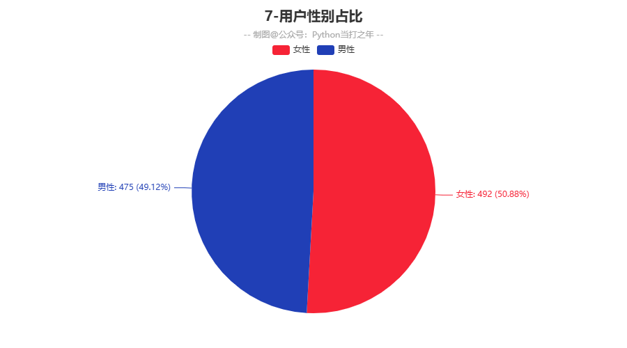
-
用户性别占比,男女基本持平,说明此舆情和性别关系不大。
3.8 用户性别占比
def get_chart():
    chart = (
        WordCloud()
        .add('', words, word_size_range=[20, 50])
        .set_global_opts(
            title_opts=opts.TitleOpts(
                title='8-评论内容词云',
                pos_top='2%', pos_left='center',
                title_textstyle_opts=opts.TextStyleOpts(font_size=20)
            ),
            visualmap_opts=opts.VisualMapOpts(
                is_show=False,
                range_color=range_color
            ),
        )
    )
4. 源码+数据
下载资源- 文章推荐
评论区未打开,无法接收留言!
 公众号
公众号
 微信
微信
Copyright © 2025
Python当打之年
ICP备案号:津ICP备2025035434号